|
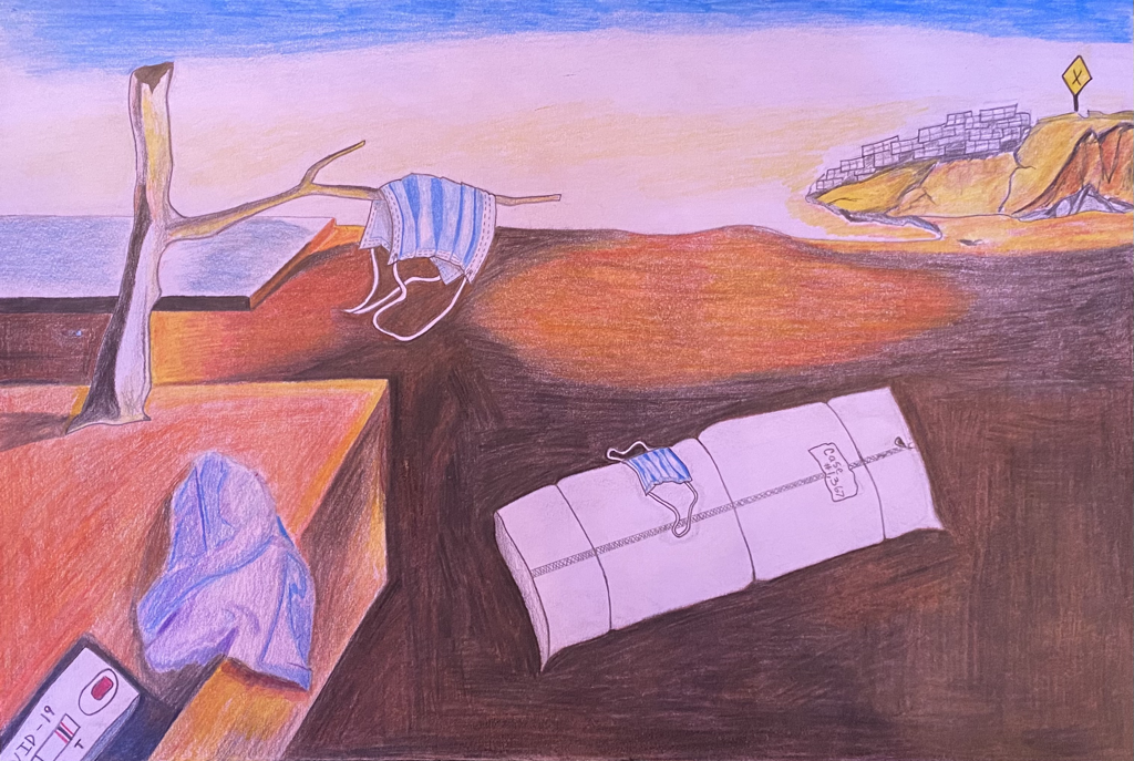
The Persistence of COVIDSize : 38 cm x 25.5 cm
Medium : Colored Pencils on an Illustration Board Completion Date : November 2020 This illustration represents society and its current issue today, COVID-19. A parody of Salvador Dalí's "The Persistence of Memory," swaps the subject pieces with items related to the rapid disease. With surrealism as its art style, this piece presents attention to detail and the things that make up the negative connotation of COVID within a 2 part collection.
|
Artist Inspiration

The Persistence of Memory

Salvador Dalí
|
Salvador Dalí is one of the most prominent artistic figures in the world. He was born in Figueres, Spain and is where he lived for the majority of his childhood. After attending art schools at a young age, the artist moved on to create works of his own that fit with his style of painting. At age 25, he was removed from his own family and home which was the beginning of Dalí's struggle. He was later removed from his art group, a surrealist movement that each person confined to. It wasn't until his arrival within the United States of America, that he had become famous for his works.
The Persistence of Memory was the piece that caused Dalí to become well known. This was due to it being a heavily debated work as people struggled to interpret its meaning. Some believed it was a story of decay as the watches drooped whilst others thought it related to Albert Einstein and his theories on relativity. However, the painting was part of the surrealism movement which allowed artist to capture their consciousness in the form of juxtaposition. It is believed that the spanish artist created the painting as a result of WWI, in order to escape reality. The clocks were a representation of the conscious world and their unreliability. In the background there are features that correlate to reality yet the act of disfiguring the watches has contradicted that theme. Dalí delves into the idea of realism clashing with a dreamy conscious. |
Planning

The original sketch was adventured upon in depth as I added elements that seemed to correlate with the theme. These features were body bags, a COVID test, a tissue and a caution sign. Some of these were decided in order to eliminate open space, yet still keeping Dalí's style in mind. The mountain seemed bare which is where I put the pile of body bags and caution sign. My plan was to connect these objects to a nightmare and a realistic situation.
|
There is a lot of negativity in the world and I wanted to focus on the theme first in this two piece project. I thought it would be easier to distinguish an opposite as opposed to vise versa. Following along, I knew I wanted to focus on a modern day problem that is well known in society today, which was COVID-19. Masks have become a symbol for the disease and it was why I incorporated them into my sketches.
Each plan had correlating themes that revolved around COVID. For instance: Isolation, caution, unknown, loss of connection and more. It wasn't until the themes were laid out that I picked an artist for inspiration. With Dali his seemed to connect with current times as much as possible. The most relatable themes being; never ending and isolation. These are easily expressive within the piece as there are no companions in sight and due to the space being so open, it highlights the idea of isolation. In addition, the themes are easily compatible with Dalí's interpretation of realism and subconscious theories. 
|
Experimentation and Process

|
In order to start the sketch I had marked the board in half both vertically (5.5 in) and horizontally (7.5 in). This allowed me to proportion the piece by looking at the reference image. From there I sketched in the prominent features such as the table, tree, mountain and body bag in the middle. In addition, I marked the sky based on which color would go where. Blue was the top margrain and it was followed by white and yellow as the image progressed down.
|
|
Once the sketch was done I started to experiment with the colored pencils. It was proven to be a challenge as I was unfamiliar with blending techniques and what colors compliment others. To begin the process, I did a layer of light brown because I figured it was a common color I was going to be using throughout the piece. I then followed it with all the colors that were available to me to see what new highlights or shadows I could make. After doing this, I realized that I should have pressed down harder on the pencils in order to get a more defined color.
Each pencil was then tested after the layering so it was known how they all looked individually. It seemed easier to label each color so I could see what to layer together in order to achieve the same pigment each time. This is shown as I continued to mix more colors with light brown on a larger scale with an addition of two colors. |

|

|
Using my new found knowledge from the experiments with the colored pencils, I applied it to the beginning stages of the drawing. Shadows were a very prominent feature within the illustration and it is the main reason as to why I began with it. It covered a majority of the space and would allow me to layer pencils and further experiment whilst in the process. Since the area was large it would be very forgiving of any mistakes I could make if I were to mix a color that didn't seem to fit with the rest. Luckily, I didn't encounter this issue. To achieve the color I had used for the shadows, I gathered brown, black, dark blue and light brown. Brown was the first layer and was applied lightly and then followed by the rest of the colors in order.
|
|
The contrast between each colors were apparent within the foreground and the sky as one was much darker. Differentiating was possible to distinguish the background from the foreground and allowed the piece to be cohesive. Areas with a lighter aspect of the drawing I found to be easy as it didn't require much layering or pressure. The technique was a simple light shading with the pencil so as to depict the white areas as all. In the end, the only main pieces that were bright or had a majority of white detail were the main focus of the piece. The masks and body bags were a part of that and allowed the viewers to focus on that before taking in the rest of the features. This depicted an almost triangle movement throughout the image.
|

|
Reflection
Colored pencils on an illustration board is a first time medium in a serious context for me. Colored pencils are unfamiliar territory as color isn't my strong suite, so doing this project was interesting. However, as I progressed I learned how different pigments contrast to others, especially when applied to value. The lighter tones within the shadows are subjectively more focused upon when viewing the piece. I learned that this was very helpful when making subjects the center piece, like the bags and mask, which is why I made the tissue a cool color with highlights.
Expanding on the theme of isolation within COVID in a nightmare setting was a vital interpretation. Each material instilled the misfortunes of COVID, especially the bags on a larger scale of morbidity. This was enhanced by the values of dark and light as they contradict each other. The light colors were a contrast to the the theme as it originally appears to be innocent until the interpretation is viewed upon. If I were to do a negative illustration again, I would go in depth on the conscious mind. In addition, I'd also try out different style techniques when finding inspiration. For instance, using Dalí's color palette but creating a city landscape. Since I had issues layering and blending with colored pencils, it'd be interesting to try out different brands to see how they compare. With the new found knowledge I can continue to experiment with entirely different colors and pressures when applying.
Expanding on the theme of isolation within COVID in a nightmare setting was a vital interpretation. Each material instilled the misfortunes of COVID, especially the bags on a larger scale of morbidity. This was enhanced by the values of dark and light as they contradict each other. The light colors were a contrast to the the theme as it originally appears to be innocent until the interpretation is viewed upon. If I were to do a negative illustration again, I would go in depth on the conscious mind. In addition, I'd also try out different style techniques when finding inspiration. For instance, using Dalí's color palette but creating a city landscape. Since I had issues layering and blending with colored pencils, it'd be interesting to try out different brands to see how they compare. With the new found knowledge I can continue to experiment with entirely different colors and pressures when applying.
Compare and Contrast

The Persistence of Memory
SimilaritiesLine -
Contrast -
Space -
|

The Persistence of COVID
DifferencesColor -
Subject -
Value -
Medium -
|
ACT Responses
1. Clearly explain and describe how you are able to identify the cause-effect relationships between your inspiration and its effect upon your artwork.
Dalí creates illusions whilst making them seem real in order to make people question what is and what isn't. I tried to follow along this process so as to make pieces seem 3D and surreal. This caused my work to acquire more depth and an illusion of raised figures.
2. What is the overall approach (point of view) the author (from your research) has regarding the topic of your inspiration?
I explored the idea of isolation within Dalí's style and it is something the artist is quite familiar with. Having locked himself in rooms to complete multitudes of artworks, isolation is something he is familiar with and wouldn't exactly compare it to something bad.
3. What kind of generalizations and conclusions have you discovered about people, ideas, cultures, etc. while you researched your inspiration?
As I researched Dalí, I have come to a conclusion that early art movements weren't especially looked up upon in the past centuries. Society was very weary and doubtful of artists' intentions.
4. What was the central idea or theme around your inspirational research?
The central idea of the research was any artwork that would allow me to incorporate face masks without seeming too out of place. It was an odd plan but as I progressed through my research it later evolved to searching for inspiration that would connect to my theme without means of question. So any works that were similar to the COVID themes I had listed earlier worked well, a few being: Isolation, caution and never ending.
5. What kind of inferences (conclusions reached on the basis of evidence and reasoning) did you make while reading your research?
Whilst completing my research I had come upon the inference that all artworks have different interpretations. Dalí's works were seen as controversial as people made their own meanings for his pieces and it seems like that can follow throughout any artist's collection.
Bibliography
Dalí, S. (n.d.). Salvador Dalí. The Persistence of Memory. 1931: MoMA. Retrieved November 30, 2020, from https://www.moma.org/collection/works/79018
Salvador Dali's The Persistence of Memory explained. (n.d.). Retrieved November 30, 2020, from https://www.phaidon.com/agenda/art/articles/2016/may/10/salvador-dalis-the-persistence-of-memory-explained/
Salvador Dali's The Persistence of Memory explained. (n.d.). Retrieved November 30, 2020, from https://www.phaidon.com/agenda/art/articles/2016/may/10/salvador-dalis-the-persistence-of-memory-explained/
